

Every young professional in the UK knows that choosing the right colour can make or break an outfit before you even leave the house. As you face client meetings or weekend plans, the shades you wear reflect confidence, creativity, and intent long before you speak. Colour psychology plays a measurable role in how your wardrobe performs for you, shaping both how you feel and how others see you. This guide gives you practical tools to master your seasonal colour choices, so every piece in your wardrobe works harder for you.
Table of Contents
- Role Of Colour In Men’s Wardrobe
- Colour Theory Basics And Wardrobe Application
- How Colour Influences Mood And Perception
- Seasonal Colour Choices For UK Men
- Mastering Colour Combinations And Mistakes
Key Takeaways
| Point | Details |
|---|---|
| Understanding Colour Psychology | Colour choices communicate personality and can influence perceptions and emotional responses, crucial for professional and personal settings. |
| Cohesive Colour Palette | Building a wardrobe with complementary colours enhances confidence and simplifies shopping, ensuring pieces work together effectively. |
| Seasonal Appropriateness | Adapting colour choices to seasonal changes improves wardrobe relevance and visual impact throughout the year. |
| Effective Colour Combinations | Applying the three-colour rule (60/30/10) prevents visual clutter and promotes a balanced, intentional outfit structure. |
Role of Colour in Men’s Wardrobe
Colour shapes how people perceive you before you even speak. It influences mood, confidence, and the impression you leave on others. For a young professional navigating the UK’s competitive work environment, understanding how to leverage colour effectively transforms your wardrobe from functional to strategic. Your colour choices communicate personality, competence, and intentionality. Whether you’re selecting a charcoal overcoat for a client meeting or a navy hoodie for weekend wear, the hue you pick carries psychological weight that extends far beyond aesthetics.
Colour psychology plays a measurable role in how your wardrobe performs for you. Research shows that colour psychology affects men’s clothing choices by reflecting personality, mood, and cultural influences. Deep blues convey trustworthiness and stability—ideal for professional settings where you need to establish credibility quickly. Greys offer sophistication and neutrality, making them the backbone of any contemporary wardrobe. Warmer tones like burnt orange or deep burgundy signal approachability and creativity, useful when you want to stand out in creative fields. The key insight is that colours aren’t arbitrary. They communicate before your words do, and matching the right shade to your skin tone, hair colour, and the occasion amplifies your natural advantages rather than fighting against them.
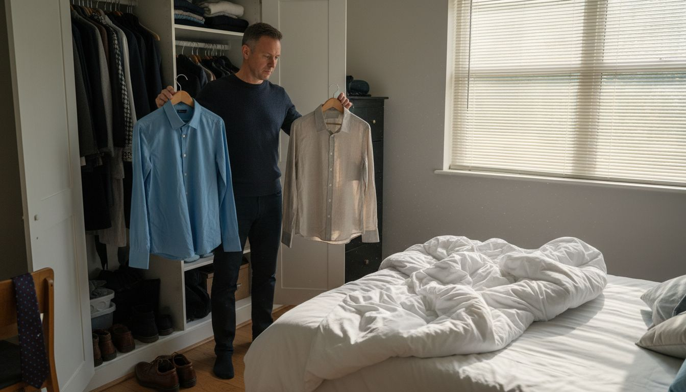
Building a cohesive colour palette requires understanding what actually works for your complexion. This isn’t about rigid rules but rather recognising which shades make you look energised versus washed out. Colour analysis and seasonal colour theory help men discover hues that complement their individual characteristics, enhancing both appearance and confidence. When you know your core colours, shopping becomes faster and more intentional. You’re no longer tempted by every trend that passes through your feed. Instead, you’re selecting pieces that work together—a navy sweater that coordinates with charcoal trousers, a deep green jacket that complements your natural colouring. This approach saves money because every piece you buy actually works in your wardrobe rather than sitting unworn. When layering seasonal pieces from contemporary collections like those offered at Vellure Homme, knowing your colour range means your new autumn jacket harmonises with existing items rather than creating isolated pieces.
The practical application of colour theory directly impacts how you dress for different contexts. Professional environments often benefit from a limited palette of two or three neutral bases with accent colours introduced through accessories. Casual weekends allow for bolder exploration whilst maintaining cohesion. What matters most is intentionality—choosing colours because they serve your goals and complement your natural features, not because they’re what everyone else is wearing.
Here’s how different colours influence perception and professional effectiveness:
| Colour Group | Impression Created | Best For |
|---|---|---|
| Deep Blues | Trust, stability | Corporate meetings |
| Charcoal/Grey | Sophistication, neutrality | Everyday professionalism |
| Warm Tones | Creativity, approachability | Creative industries |
| Reds | Confidence, energy | Presentations, pitches |
| Greens | Calmness, dependability | Collaborative settings |
| Creams/Lights | Freshness, openness | Summer or casual wear |
Pro tip: Start by identifying whether you look best in warm tones (earth tones, warm greys, golden hues) or cool tones (blues, silvers, jewel tones) by holding different coloured fabrics against your face in natural light and observing which ones make your skin appear clearer and more vibrant.
Colour Theory Basics and Wardrobe Application
Colour theory isn’t mystical or overly complicated. At its core, it’s about understanding how colours interact with each other and how to use those relationships to create outfits that look intentional and polished. The foundation begins with the colour wheel, which shows how hues relate to one another. Complementary colours sit opposite each other on the wheel and create high contrast, whilst analogous colours sit next to each other and produce harmony. For practical menswear, this means you can either pair contrasting colours for visual impact (think navy with warm caramel) or similar tones for subtle sophistication (charcoal layered with slate grey). Most professional men benefit from understanding these basic relationships because it removes the guesswork from getting dressed.
The most actionable tool for everyday wear is the 60/30/10 colour rule, which simplifies how to balance colours in an outfit. Your dominant colour takes up 60 percent of your look, the secondary colour fills 30 percent, and the accent colour claims just 10 percent. The 3-colour rule helps balance dominant, secondary, and accent colours using these proportion guidelines, which enhances visual harmony and prevents outfit clashes. In practical terms, this means if you’re wearing a charcoal sweater (60 percent), pair it with light grey trousers (30 percent) and introduce a pop of colour through a burgundy scarf or pocket square (10 percent). This approach works because it prevents your outfit from looking chaotic whilst still allowing personality to shine through. When you’re selecting seasonal pieces from collections focused on sweaters, hoodies, and overcoats, applying this rule means your new pieces automatically coordinate with what you already own. A navy overcoat becomes your 60 percent, a white shirt underneath is your 30 percent, and a subtle patterned tie introduces your 10 percent accent.
Understanding your personal colour harmony is equally important as knowing the proportions. Colour relationships and harmony principles help you interpret the colour wheel and apply complementary or analogous rules to different settings and personal styles. Warm skin tones generally harmonise with earth tones, warm greys, and rich jewel tones, whilst cool skin tones sing when paired with silvers, cool greys, and clear brights. Context matters too. A creative industry allows bolder colour combinations, whilst corporate environments reward restraint with just one or two accent colours against neutral bases. The trick is recognising what works for your specific colouring, then building a system around those discoveries rather than chasing every trend that arrives.
Pro tip: Take a photograph of an outfit you’ve received compliments on, then identify which colours dominate and what percentage each takes up—this becomes your personal reference guide for building similar combinations in the future.
How Colour Influences Mood and Perception
The colour you wear doesn’t just sit on your body. It broadcasts a signal to everyone around you and, more importantly, it shapes how you feel about yourself. Colour psychology is rooted in the simple fact that different hues trigger genuine emotional responses, both in you and in those observing you. When you pull on a deep burgundy jumper on a grey Monday morning, you’re not just choosing a garment. You’re selecting a mood enhancer that can shift your confidence levels and mental state before you’ve even stepped out the door. This connection between colour and emotion is why wearing black after a difficult week feels grounding, or why a bright yellow accessory lifts your spirits during winter. The science supports what you’ve probably already experienced: your wardrobe colours genuinely influence your psychological state.
Beyond your own mood, colour choices evoke emotions and influence how others perceive you, making them a tool for social communication. Red creates excitement and energy, signalling confidence and assertiveness. Think of the power of a red tie in a boardroom. Blues and greens promote calmness and trustworthiness, which is why so many corporate environments default to these tones. Warm neutrals like camel and tan convey approachability and creativity, useful when you want colleagues to see you as collaborative. In professional settings, this isn’t manipulation. It’s strategic communication. You’re intentionally using colour to align your external appearance with the message you want to send. When you’re building a modern wardrobe for UK winters with contemporary pieces like sweaters and overcoats, understanding these associations helps you select colours that serve your professional goals and personal brand.
Building a calm, confident wardrobe through colour strategy requires matching your palette to your lifestyle and aspirations. Colour palettes can set mood and influence social contexts, meaning thoughtful colour choices help you navigate professional and personal spaces more confidently. Rather than reacting to every trend, consider what emotions you want to project most frequently. If your work demands steady, reliable energy, build your base around cool neutrals like charcoal and navy with occasional warm accents. If your role requires creative problem solving, incorporate deeper jewel tones and slightly bolder colour combinations that signal innovation. The practical benefit is that once you’ve identified your colour intentions, getting dressed becomes simpler. You’re no longer second guessing yourself. Instead, you’re reaching for pieces that intentionally support your emotional and professional positioning. This consistency builds confidence because you know each colour choice is working for you, not against you.
Pro tip: Wear a colour that aligns with the energy you want to project before any important meeting or presentation, and notice how it influences both your confidence and others’ reactions throughout the day.
Seasonal Colour Choices for UK Men
The UK’s distinct seasons demand different colour approaches, and getting this right transforms how relevant your wardrobe feels throughout the year. Autumn and winter call for warmth, depth, and richness that ground you visually as the daylight shrinks and temperatures drop. Spring and summer allow lighter, brighter palettes that energise and complement the extended daylight hours. Rather than treating seasonal colour shifts as restrictive rules, think of them as opportunities to refresh your visual impact four times yearly. A charcoal overcoat dominates winter, but that same palette feels heavy come May. Understanding how seasons influence colour choices prevents you from looking out of step with your environment and ensures your wardrobe investments feel seasonally appropriate when you actually wear them.
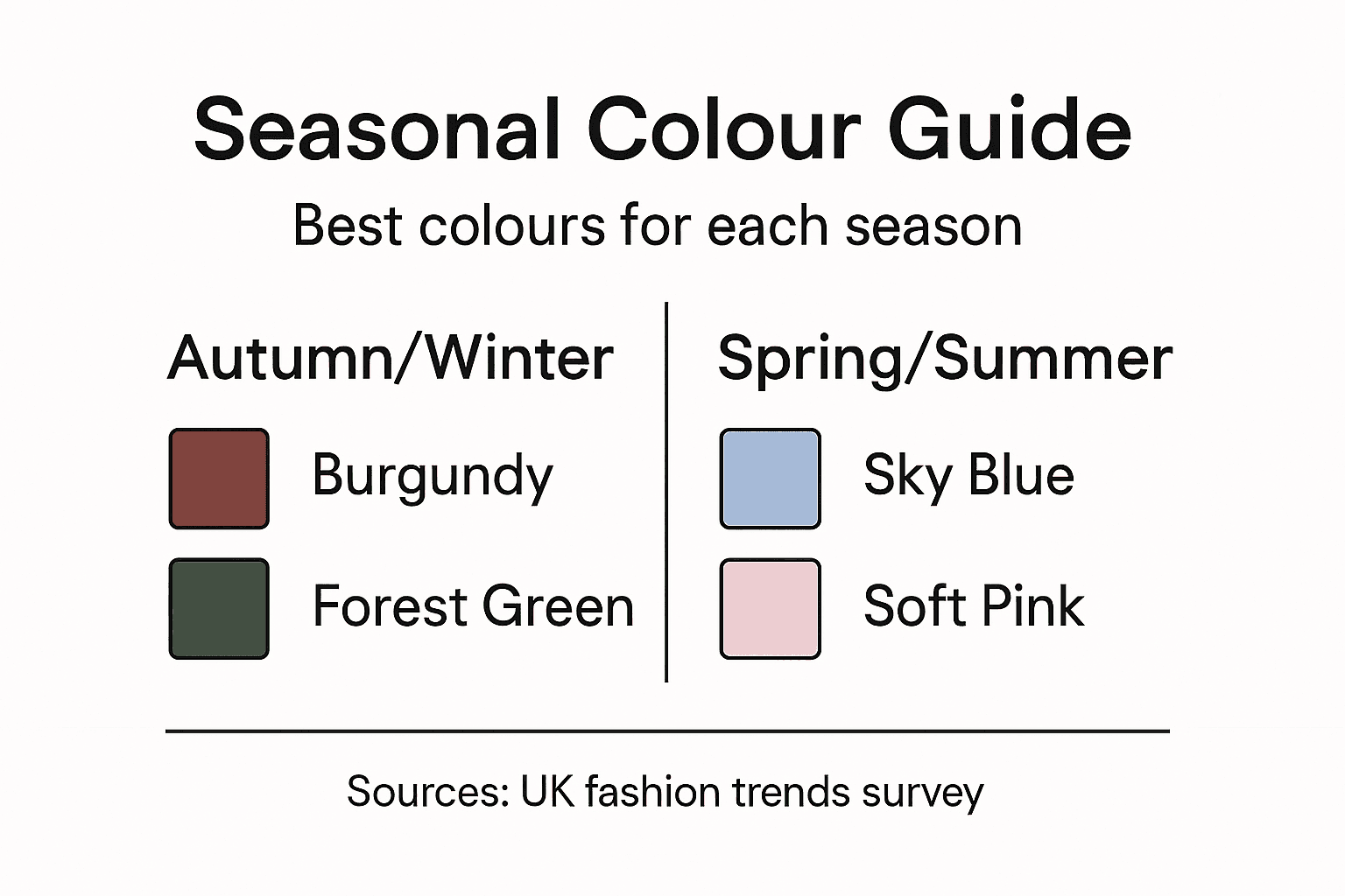
Autumn and winter in the UK benefit from deeper, richer tones that echo the natural landscape. Autumn and winter colour trends for menswear highlight contemporary palettes blending bold, subdued tones with heritage influences that work beautifully for UK professionals. Deep burgundies, forest greens, navy blues, charcoal greys, and warm caramels create visual warmth without feeling summery or inappropriate for colder months. These shades complement the heavier fabrics typical of the season—wool overcoats, chunky knitwear, and dense cotton—making your pieces look cohesive rather than fighting against each other. When building your winter wardrobe with contemporary pieces like sweaters and hoodies, these deeper tones feel natural against the grey British sky. Layering a burgundy jumper under a charcoal overcoat creates depth and visual interest whilst maintaining the grounded quality that winter demands. Metallic accents like bronze or gold jewellery introduce subtle richness without jarring against these muted, sophisticated tones.
Spring and summer demand a strategic lightening of your palette without abandoning intentionality. London Fashion Week’s seasonal colour palette demonstrates how contemporary design balances vibrancy with subtlety, encouraging personalised approaches to seasonal dressing. Whilst this specifically references autumn and winter, the principle applies universally: choose colours that feel right for your environment and personal colouring rather than defaulting to whatever trend magazines suggest. Warmer months allow soft blues, sage greens, creams, and pale greys that feel refreshing without appearing washed out. The key is matching lightness with appropriate context. A pale blue linen shirt works brilliantly for summer weekends, but a powder blue would look too delicate for corporate autumn meetings. Seasonal colour shifts shouldn’t mean buying entirely new pieces. Instead, introduce new seasonal staples that work with your existing neutral base. A cream summer jumper pairs just as effectively with your core navy trousers as your winter charcoal version.
This overview compares seasonal colour strategies for UK men:
| Season | Key Colours | Wardrobe Focus |
|---|---|---|
| Autumn/Winter | Burgundy, forest green, navy, charcoal, caramel | Layering, warmth, visual depth |
| Spring/Summer | Soft blue, sage green, cream, pale grey | Lightness, comfort, subtle coordination |
Pro tip: Review your wardrobe at the start of each season and identify which pieces feel seasonally appropriate, then intentionally add 2-3 new pieces in on-trend seasonal colours that coordinate with your existing neutral base.
Mastering Colour Combinations and Mistakes
Most men make the same colour mistakes repeatedly because nobody’s explicitly taught them the rules. You grab a navy jumper, a grey shirt, a black belt, and burgundy trainers, then wonder why the outfit feels chaotic. The problem isn’t that these colours are individually wrong. It’s that you’ve violated the fundamental principle of colour balance. Too many competing colours create visual noise that distracts from your actual presence. The solution isn’t memorising endless colour charts or following rigid restrictions. Instead, you need a simple framework that keeps your outfits visually coherent whilst still allowing personal expression. Once you understand the underlying logic, getting dressed becomes intuitive rather than stressful.
The most common mistake is introducing too many distinct colours into a single outfit. Mastering colour combinations requires understanding proportions and colour roles through the three-colour approach, which provides a practical system to avoid overcomplication. When you wear five different colours, your eye doesn’t know where to focus. Instead of seeing you, people see a kaleidoscope of hues. The three-colour rule eliminates this by restricting your outfit to just three tones: one dominant colour (60 percent of your look), one secondary colour (30 percent), and one accent colour (10 percent). This doesn’t mean boring repetition. A charcoal sweater with light grey trousers and a burgundy scarf hits all three colours, but the proportions create visual order. Another common error involves misunderstanding neutrals. Many men think black, white, navy, and grey are interchangeable. They’re not. Black and navy clash because they’re too similar yet distinctly different. Grey and charcoal create the same problem. Choose one neutral base, then build around it. Once you’ve selected your dominant neutral, the secondary and accent colours become the interesting part of your outfit rather than the confusing part.
Implementing the three-colour system requires practice but becomes automatic quickly. Step-by-step implementation of colour combinations demonstrates how understanding colour roles and proportions maintains harmony and reduces styling errors. Start by picking your dominant colour, which typically comes from your largest piece: an overcoat, jumper, or shirt. This sets your visual foundation. Then select a secondary colour that complements rather than competes with your dominant hue. Finally, introduce your accent colour through a smaller piece like a scarf, pocket square, or shoes. This accent should draw the eye without overwhelming the overall composition. Common exceptions exist for neutrals and metallic accessories, which don’t count against your three-colour limit. A black belt and silver watch function as infrastructure rather than colour choices, so you can incorporate them freely. Many young professionals worry this system feels constraining. Actually, it’s liberating. Instead of agonising over whether five colours work together, you’re confidently building outfits knowing they’ll feel balanced every single time.
Pro tip: Use your phone’s camera to photograph your outfit before leaving home, then assess whether your colours feel balanced or if one shade is visually dominating the composition.
Elevate Your Wardrobe with Purposeful Colour Choices
Understanding the role of colour in men’s clothing is key to building a wardrobe that not only looks great but boosts your confidence and professionalism. If you struggle to find pieces that complement your skin tone and fit your lifestyle, or if choosing the right seasonal colours can feel overwhelming, Vellure Homme offers a carefully curated collection of premium sweaters, hoodies, and overcoats designed to simplify your style journey. By focusing on timeless designs with rich seasonal palettes, you can create cohesive outfits that reflect your personality and career ambitions.
Explore our contemporary menswear range today at Vellure Homme and discover how intentional colour combinations can transform your look. Take advantage of our seasonal selections and promotional offers now to build a calm, confident wardrobe perfectly suited for the UK climate and your personal style. Don’t just follow trends; learn how to master your colour palette with pieces made to work harmoniously together for every professional and casual occasion.
Frequently Asked Questions
How does colour psychology influence men’s clothing choices?
Colour psychology influences how you are perceived, affecting mood, confidence, and the impression you leave on others. Deep blues convey trustworthiness, while warmer tones like burnt orange signal creativity, impacting your professional and social interactions.
What is the 60/30/10 colour rule in men’s outfits?
The 60/30/10 colour rule is a guideline for balancing colours in an outfit: the dominant colour makes up 60% of the look, the secondary colour 30%, and the accent colour 10%. This creates visual harmony and prevents chaotic outfits.
How can I determine which colours suit my complexion?
You can determine which colours suit your complexion by using colour analysis and seasonal colour theory. Hold different coloured fabrics against your face in natural light to see which shades make your skin appear vibrant and energised.
What are some common mistakes men make when combining colours?
Common mistakes include introducing too many distinct colours in an outfit, which creates visual noise, and misunderstanding the role of neutrals. It’s essential to limit your outfit to three colours using the three-colour rule for a balanced appearance.
Recommended
- Men’s Fashion Trends 2025 Guide for UK Style Success – Vellure Homme
- What Is Contemporary Menswear and Why It Matters – Vellure Homme
- 7 Key Men’s Fashion Dos and Don’ts for Modern Style – Vellure Homme
- Role of Fabric in Men’s Fashion Choices – Vellure Homme
- How to Style Cork Accessories for Chic Sustainable Looks – The Cork Store
- Golf Outfits for Men: The Ultimate Guide – Le Club Original